Sears Sunken Garden
This was a team project that I did with Sayuri Adachi (saadachi.com)
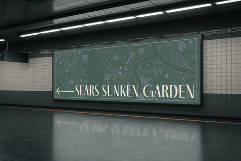
This was a community based team project. Sears Sunken Garden is located in the Homan Square neighborhood in Chicago, Illinois. It was built as an addition to the Sears Roebuck & Co headquarters built there in 1906. The headquarters are now abandoned and the garden is getting redesigned by landscape artist Piet Oudolf. Our job was to create rebranding, signage and wayfinding for the garden while also keeping the community itself at the center.

Concept Summary
We were very inspired by the garden itself and the original Sears Roebuck & Co headquarters and catalogs. We decided to keep that bold purple from the current branding but also include a few other colors, for design depth. We chose the typeface Fino Sans because we felt it had an old charm to it, similar to that of the original Sears logo. When redesigning the logo, we wanted something that had a deeper meaning to it, but also was relevant to the garden. We chose a dragonfly because of its symbolism of transformation and change, something that resonated well with the garden and community. It also looks a little like a flower and we appreciated that duality! We wanted to make sure that the designs we chose were applicable to all members of Homan Square as well as people outside of the community. Our designs are bold and eye-catching, while also simplistic to draw people in and allow them to enjoy the garden in all its beauty and tranquility.